ART DIRECTION
- Melissa Grayson
PRODUCT DESIGN
- Marissa Panganiban

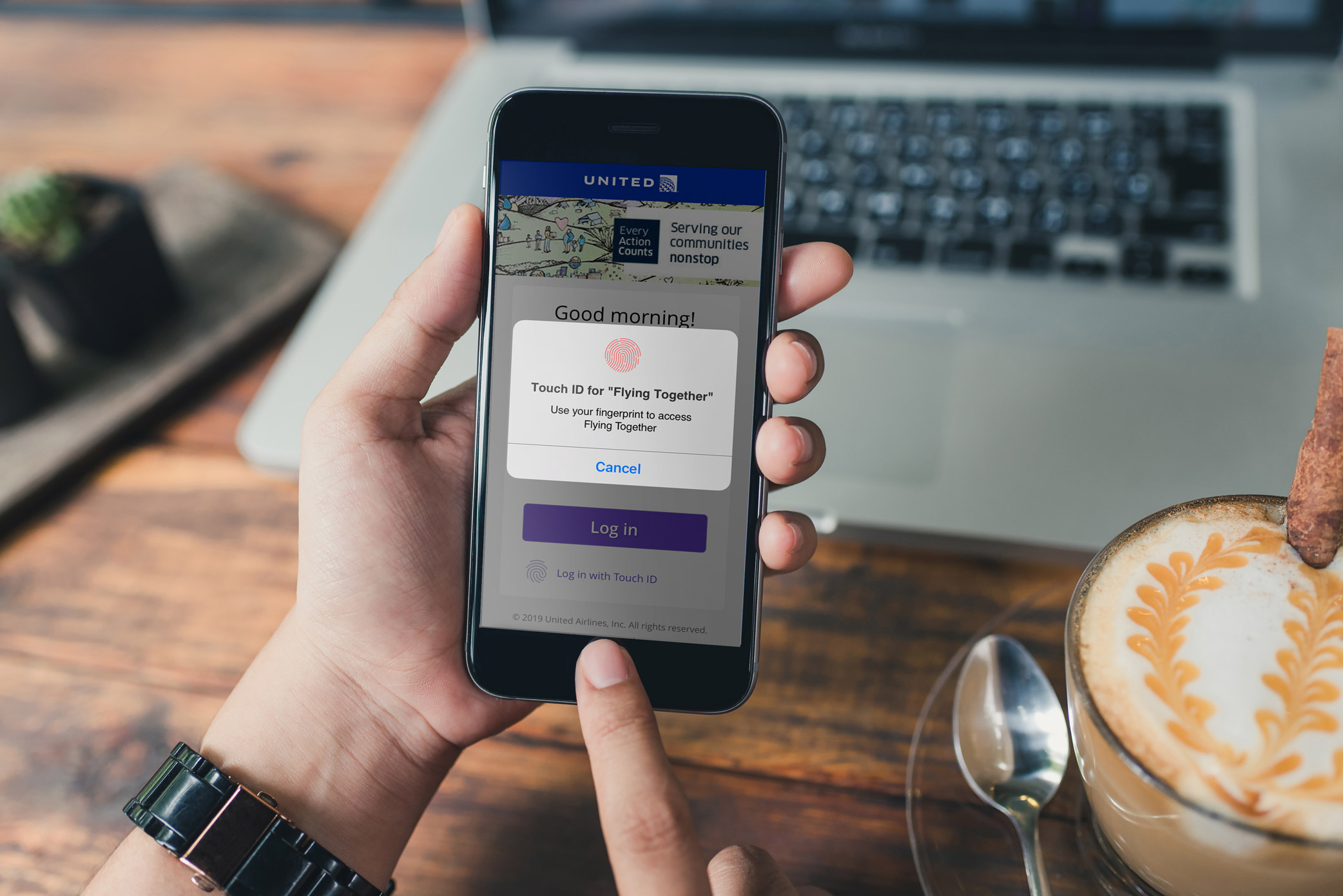
After redesigning the Flying Together website, some pain points were eventually reported from users. A main hurdle was the need to keep the site secure through logins, but logging in at each session was cumbersome for frequent users. Management deduced that if the website was housed in an app, we would be able to take advantage of native biometric login features that would reduce some of the friction encountered during frequent sessions. In addition, they wanted to explore the scope of work for including notification capabilities in the app.
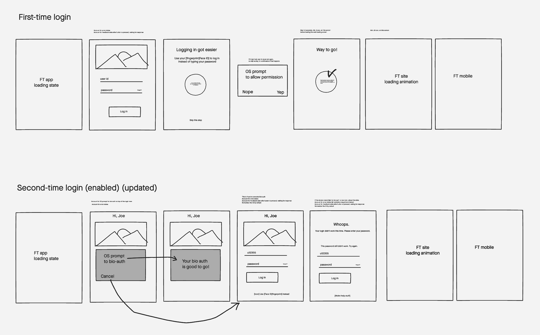
It was determined that we could wrap the website within a native app and only build out the login features natively. I worked with a product designer to build the user flows. I walked her through the process of building out user flows. With the guidance of management and myself she sketched out rough user flows. These were reviewed as a group. In addition, I advised the designer on the process of storyboarding and the scope of the notifications efforts began to take shape.

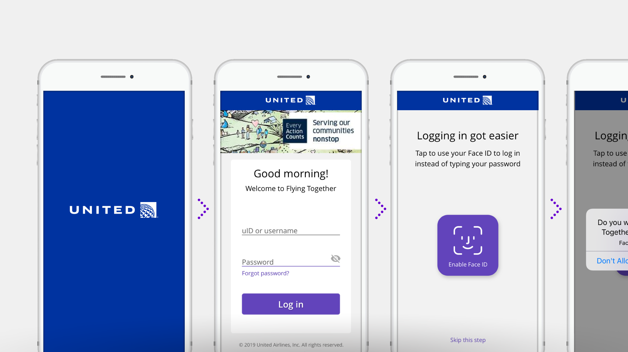
From here, the designer started to build out user flows into high fidelity mockups and fleshed out any additional flows and versions that would be needed. I advised on styling, making sure that the colors, button sizes, and branding matched the design system. I also made sure that the smallest possible viewport was taken into account along with how the design would translate to larger viewports.

After multiple group reviews, development meetings, revisions, ticket logs, and QA checks, the app was launched for the 90,000 team members at United to use. The notifications effort was postponed for a future iteration.
